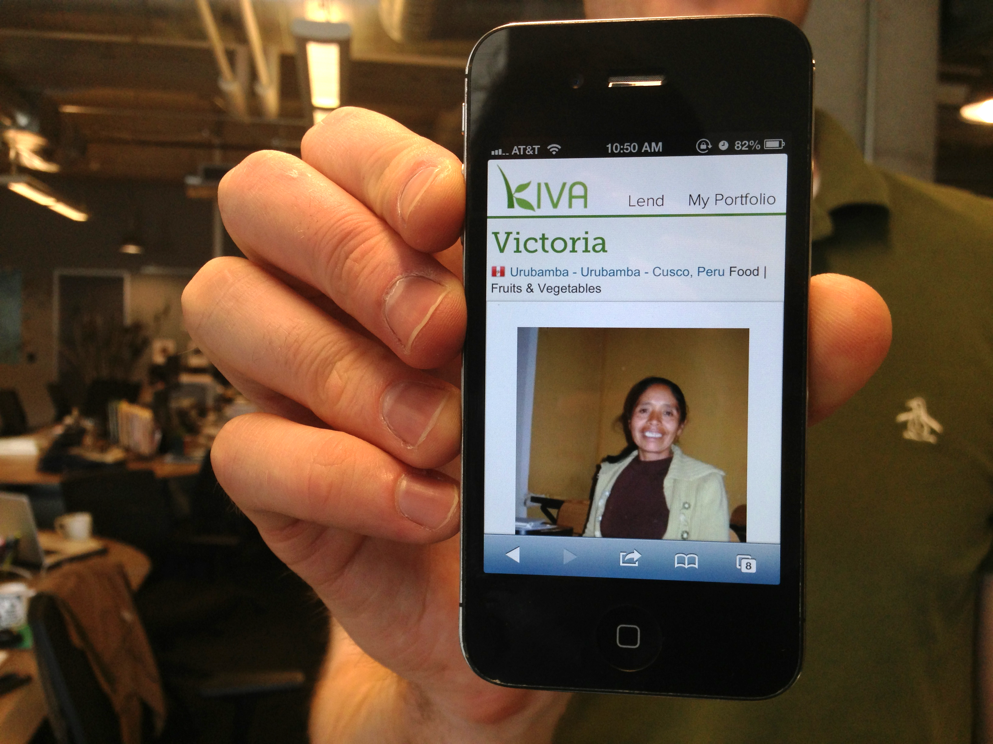
Industry wide it’s no secret that mobile devices will represent a significant portion of computer usage in the near future. Even today nearly 9% of Kiva’s traffic comes from smartphones, and we’ve seen these numbers grow steadily year over year. This is great news for Kiva, as it shows people are interested in making loans on their mobile phones. But we also know that we could be doing a better job helping visitors find a borrower they want to support and complete the checkout process. Looking at our mobile data we’ve noticed that visitors with mobile phones are leaving at over twice the rate of typical desktop traffic. Seeing this trend, our development team has been itching to improve the mobile experience on Kiva for a long time, and with our most recent release, we’re excited to let you know we’ve taken the first step towards a mobile optimized site.
As an initial toe in the water of mobile, we’ve concentrated on delivering an optimized lending experience for your smartphone. This means that selecting a borrower from the lend page, viewing them in greater detail on the borrower page and proceeding through checkout are now designed to fit the smaller screen of your iPhone or Android device.
The next time you look for a borrower, you’ll find that won’t have to pinch-and-zoom to read their name or loan details. You’ll also be able to click into the search box and filter the long list of loans using country, sector, activity, gender or keywords. In future releases, we plan to continue these improvements by creating a simple interface sized specifically for your phone that includes all the filters on the standard site.

Moving from this list of loans to a specific borrower, you’ll continue to see a page optimized for mobile that includes all the details you’re accustomed to seeing -- a photo, story, loan terms, the field partner, etc. -- in an easy to read format. We’ve even provided easy access to the lend button from anywhere on the page. And once you’ve selected a borrower and continue to your basket you’ll find each step -- from login to thanks -- formatted for your phone.
We’re really excited about this initial mobile experience and the early results we’re seeing. In a preliminary set of tests during a limited release, we’ve seen improvements of 30 to 40% in the number of mobile visitors who are making a loan on Kiva.
While we already have ideas for improvements, we’d also like your feedback. How is the new mobile lending experience working for you? Are you interested in making a loan from your phone? Are you having any problems? Let us know. Your comments will help us improve the Kiva website. Send them our way at blog@kiva.org.
PREVIOUS ARTICLE
New Field Partners: Kiva and CAMEO team up to bring micro-loans to California small businesses →NEXT ARTICLE
Holi: Because one day, one name, and one way to celebrate aren’t enough →


