After several weeks of extensive user testing, we’re excited to release a new site update for the lending team "About" pages next week. This is all part of a concerted effort to better integrate lender feedback into our design process, and I’m personally excited about how much we’ve been able to do with this next round of changes. In addition to your emails and comments on the blog and lending teams, we sent out multiple surveys, interviewed a number of lenders and even had lenders visit our office so that we could learn directly from their experiences. I know the whole Kiva team would agree that it’s been such an insightful process.
One example of our learnings was the discovery that there were several features our community wanted that weren’t part of our original design: what individual loans are being used for, how many team members are supporting each loan and whether or not they’re set to expire in the next 48 hours.
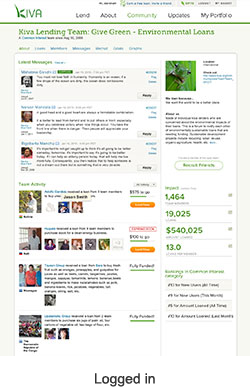
Similarly, there are parts of the current design that weren't a priority for a majority of teams. Most people weren’t interested in seeing their own team description, so we de-emphasized its placement if you’re already a member (but if you haven’t yet joined a team, the description is still front and center). The team stats and rankings were also less important to team members than the Latest Activity, so we relocated those to a secondary position in the sidebar. (Click on the thumbnails below to enlarge.)
The primary goal with these changes is to better highlight team activity, improve the connection between lenders and borrowers and make it easier for team members to see what their fellow members are up to. Here’s a summary of the biggest changes coming with next week's update:
- Larger photos: Probably the most common feedback we received was to bring back the original size of borrower photos. Many lenders felt like they weren’t able to make an emotional connection with smaller thumbnails, which is such an important part of the Kiva experience.
- Ability to see all team members on a loan: Lending teams love to coordinate with each other to support loans, so you can now see how many team members have lent to a borrower. You can also hover over a lender’s photo to see their name. We hope this will further support your collaborative efforts and make it easier to decide which loans to support.
- More information about the loan status: We’ve had a long-standing request to add an "Expiring Soon" notification to this page, and so we’ve included it with this update. Now lenders can easily see when a teammate’s loan needs a little extra attention before it expires.
- Moved impact stats and team rankings to the sidebar: As mentioned above, most of the lenders we spoke to didn’t feel like this information was as important as other items on the page, so we moved these modules to the side.
- Moved the team description to sidebar for logged-in members: The team description is an interesting part of the page because it's essential for people who want to learn about a new team, but it isn’t as important for existing team members. With the new layout, non-team members will see the team description at the top of the page, while existing team members will see it displayed in the sidebar.
With these changes scheduled for next week, I wanted to say thanks again to our community for their helpful perspective throughout the design process. We’re looking forward to hearing what you think about these latest updates!
Have questions? Comments? Send them our way at blog@kiva.org.
Have questions? Comments? Send them our way at blog@kiva.org.
PREVIOUS ARTICLE
Featured Volunteer: Pam McMurry, the grass is greener on this side with over 1,000 translated loans! →NEXT ARTICLE
3 Remarkable things I learned in Kosovo →


