At Kiva, we’re always working hard to improve our website. We believe all interactions on the site should be accomplished with minimal effort and create a memorable experience. With that in mind, we recently made some design changes to lending team pages.
In doing so, our primary goal was to highlight the ways existing and potential members can get involved with a team. To do this, we cleaned up two areas within team pages: the “about” page and team message boards. After receiving feedback from team members, we wanted to write this blog post to dive deeper into both these recent changes and talk about areas where we see room for future improvements.
Lending teams are dynamic and passionate communities that interact with Kiva’s website in a variety of ways: members make loans, post messages, recruit new members, measure the impact of their loans and compare their teams against others through rankings. At a glance, we hope the team overview (or “about”) page will be a summary of the team's activity, giving existing members a good sense of what’s going on, while also providing information for prospective members who are deciding whether to join.
While long-time team members seemed to be used to the former layout, we felt that the page was less than ideal for new and prospective members. New visitors were often overwhelmed with the amount of information on the page. By cleaning up the basic team information, we strove to make this page more readable and easy to digest for first-time visitors. We also moved recent messages and latest activity higher up on the page to make these dynamic activities more prominent -- and even added a new section to display fundraising loans currently supported by a team.
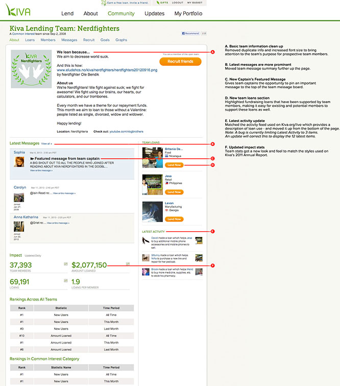
In making these changes, we adjusted the sizes of text and images on the page. There are always trade-offs as we attempt to emphasize the most important elements on a page, balance the amount of information displayed, and apply a font or image size suitable for a new design.
Some of you have written to us or posted on the message boards that these changes have made certain areas more difficult to read. We sympathize with these concerns and want you to know we are looking at different ways to incorporate your feedback while maintaining an experience that works for the many different types of team members.
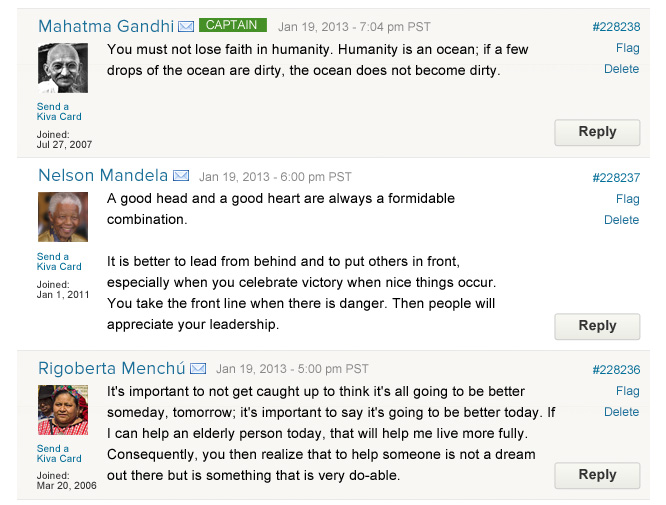
One change that we know we could have done a better job with is team message boards. Being able to read and easily respond to messages is essential for any successful message board. Our solution to de-clutter the page by hiding controls such as “Reply” until after you roll over a post overcompensated for the poor readability of the previous layout. However, this came at the expense of people’s ability to respond to a message, and was particularly frustrating for users of touch devices like mobile phones and iPads.
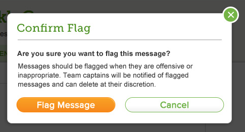
In addition, the placement of other controls such as “Delete” and “Flag” in close proximity to “Reply” caused many people to take these actions by mistake. We’re actively working on a better solution that includes persistent controls and a confirmation step before deleting or flagging a post. Below, you’ll find a sneak peek of our proposed solution, which we expect to release -- pending it’s performance during user testing -- within the next few weeks.


We have high hopes that this redesign will result in an improved experience for new and existing members of the Kiva community. And, as with everything we do at Kiva, we’ll continue to evaluate the performance of these changes to see how well they help us meet our goal of improving lender engagement.
We’ll be looking at quantitative data, such as how many people are joining teams, whether the number of message board posts are trending up or down, etc., but we’re also interested in how this works for individuals like you. If you have thoughts, please let us know.
We can’t always satisfy everybody by implementing the changes they request, but we assure you that your feedback helps us improve Kiva’s site by better understanding how you use it, what’s working well and where we can do better.
Have questions? Comments? Send them our way at blog@kiva.org.


